NOODLE & BAO
i made a book cover! (and the book that goes inside, too, but you won't see that for a little while)
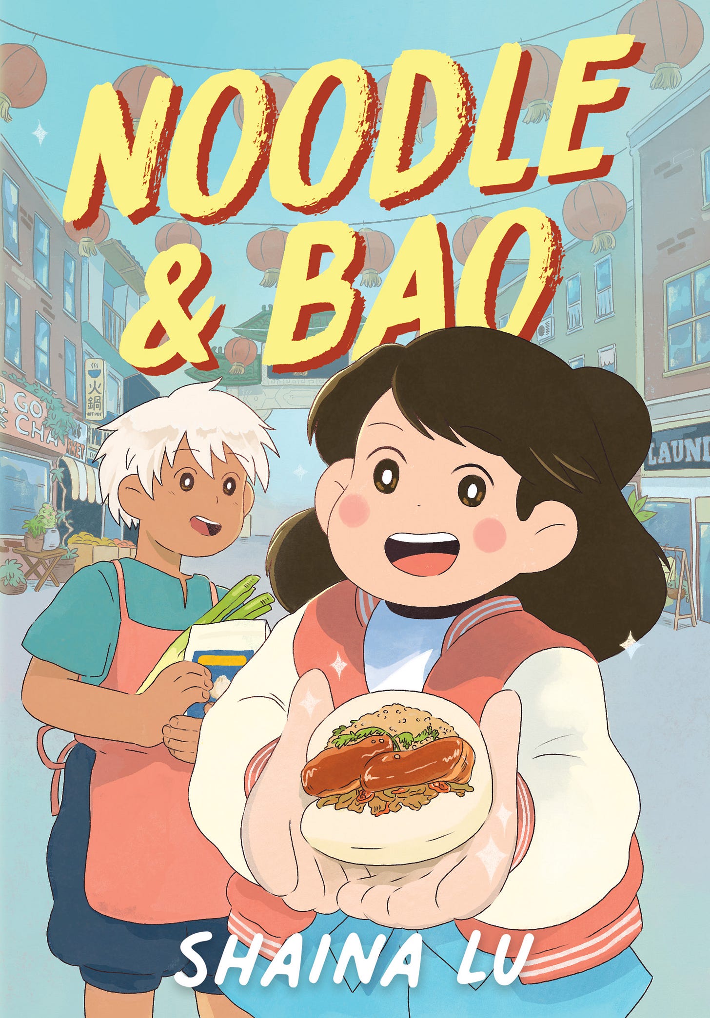
I’m *so* excited to share the cover of my debut MG graphic novel NOODLE & BAO!
Here’s the official summary:
Perfect for fans of Animal Crossing and Measuring Up, this whimsical and empowering middle grade graphic novel follows a girl who helps her friend’s humble food cart stand its ground against the gentrification of their Chinatown neighborhood.
Momo has lived in Town 99 her entire life. She knows all its quirks and rhythms: the best places to buy fruit, practice tai-chi in the park, and most of all, knows where to get the best meal: a place called Noodle & Bao, run by Momo’s best friend Bao, and their amah, Noodle.
But Town 99 is changing. Rent is becoming unaffordable for Momo and her parents, and even Noodle & Bao has been edged out of its storefront, which was just recently bought out by a new business venture—Fancé Café. Fancé is run by the ambitious Ms. Jujube and her henchmen, who claim they're only beautifying Town 99 with good business.
Momo knows that’s not true, and knows that if she doesn’t do something, she’ll lose everything she loves about her neighborhood. From undercover recon to a cook-off proposal, protest signs to petitions, Momo and Bao are on a mission to protect Town 99. Will they succeed before it’s too late?
cover process
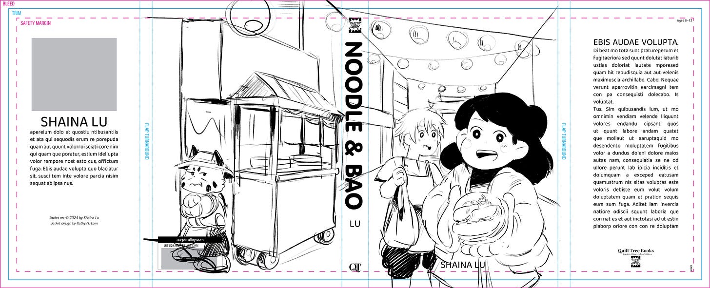
sketches!
Initially, I thought the cover just needed to have the main characters, Momo and Bao. (and yes, I know it’s confusing that the book is named NOODLE & BAO, which is the name of the food cart.)
I did a bunch of loose sketches and only minimally thought about the title & words (this will come back to haunt me later…) I tried a bunch of different vibes — delicious food highlight? scary antagonist? the cute lying in the grass shot?

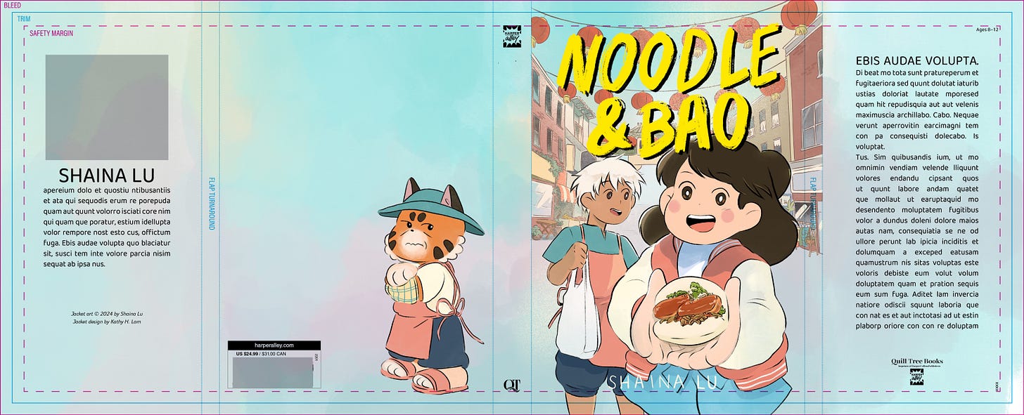
We landed on the very last sketch in the bottom row, with Momo holding out a gua bao, with Bao and Noodle standing behind her. My editor/design team also thought it would actually probably be important for the town to be visible, since the book is …about protecting the town! D’oh! Silly me.
All those changes made it so that Noodle didn’t fit anymore, or would look like a teeny tiny speck because of perspective, so she was shunted to the back.
color
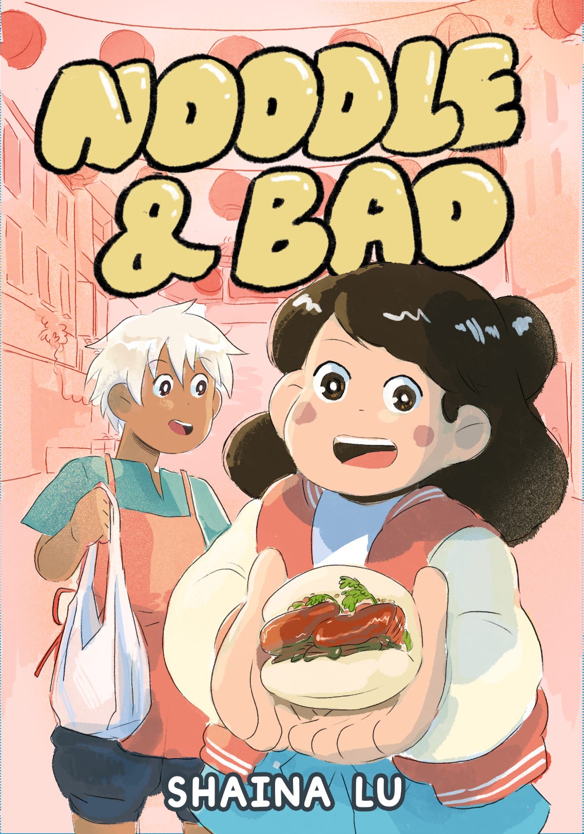
We tried a few options here. The book is with a limited palette (black and white, with one pinkish color), so my editor suggested keeping the limited palette in the background.


But, the pink was reading very Valentine’s Day (oops), so we pivoted to a more painterly blue background.
words!
Originally, the design team wanted to have a cute, hand-drawn bao-inspired title. But, it wasn’t working. It was giving macaroni, not bao. And when I polled my third grade students in Chinatown, we found we had very strong feelings about the bao/macaroni/bubble font. The kids either *really* loved it or *really* hated it. One child whispered into my ear, “I really don’t like that one.”
I tried sketching my own title here. Not the best handwriting…
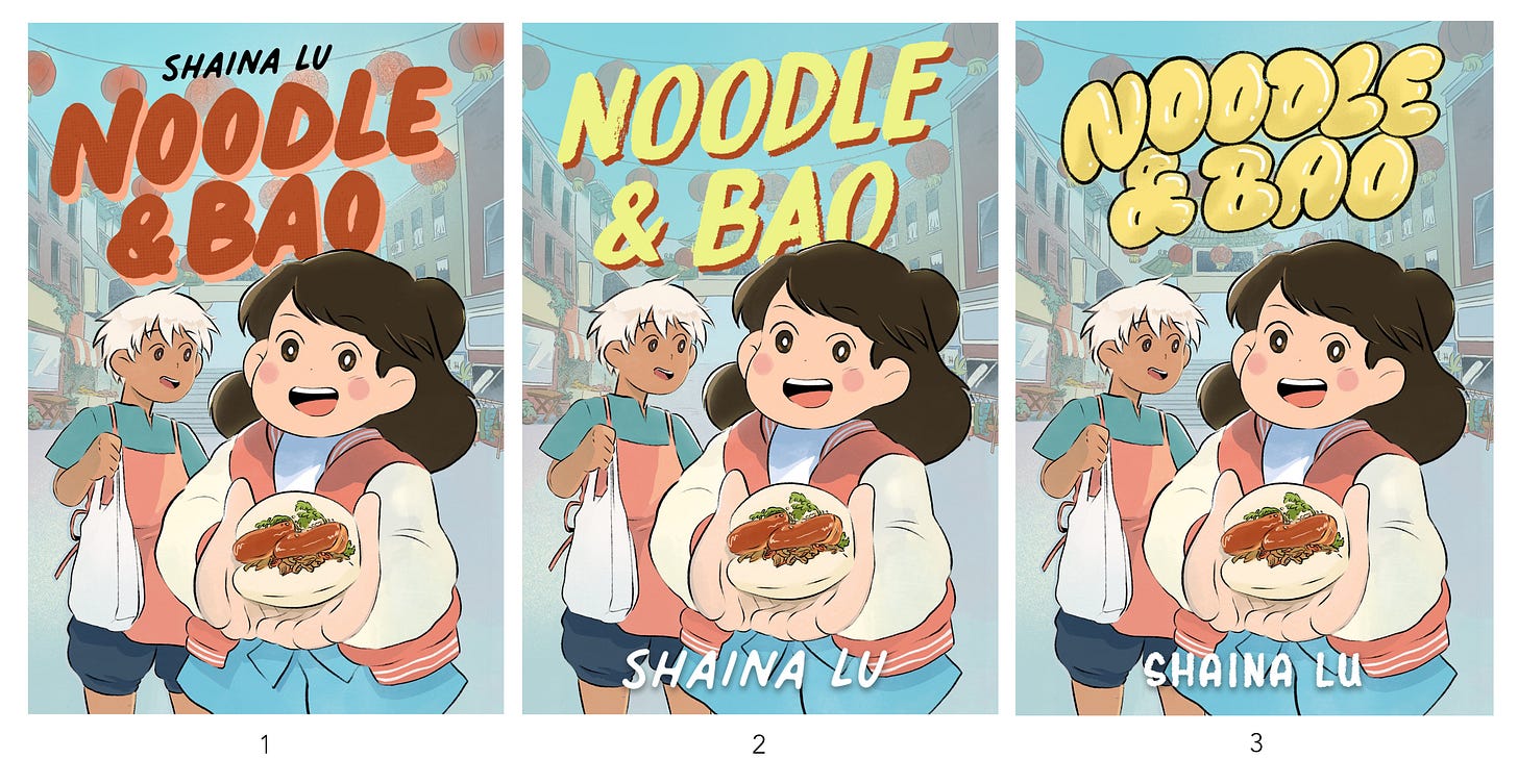
And my design team landed on these three options:
The cover really was a team effort — I’m so grateful to the extremely patient Kathy Lam and Celeste Knudsen for their lettering, design, & AD. I had no idea how hard putting a title on a book would be, and they did all of the work.
Finally, we landed here! This is the final cover, in all its glory. Wow!!! Yay!!!
Stay turned until it’s out 10/15 this fall from Quill Tree Books / Harper Collins or preorder now here!!! Stay tuned for more!
Ok byeeeeeeee


:o!!!!!!!!!!!!!!!!!!!!!!
WOW